Roy Lichtenstein’s Art Style Explained Through Ben-Day Dots, Comics and Pop Art
Roy Lichtenstein’s Art Style Explained
The Whitney Museum of American Art opened Roy Lichtenstein: Like New on October 11, 2026, with more than 130 works from the early 1940s to the 1990s. For the first time, the museum shows all eight works from his 1962 debut at Leo Castelli Gallery together, in a room built to recall the original show. The exhibition stays open until May 10, 2027.
Visitors in 1962 saw paintings copied from cheap comics. A closer look shows every dot, outline and word balloon was a decision. Once you can read those decisions, his signature style stops looking simple, and you can tell a painting, a print and a poster apart before you check a single label.
What Is Roy Lichtenstein’s Art Style?
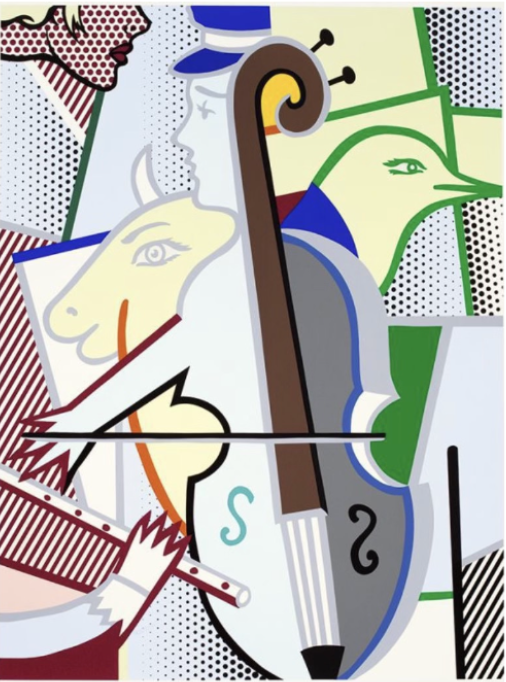
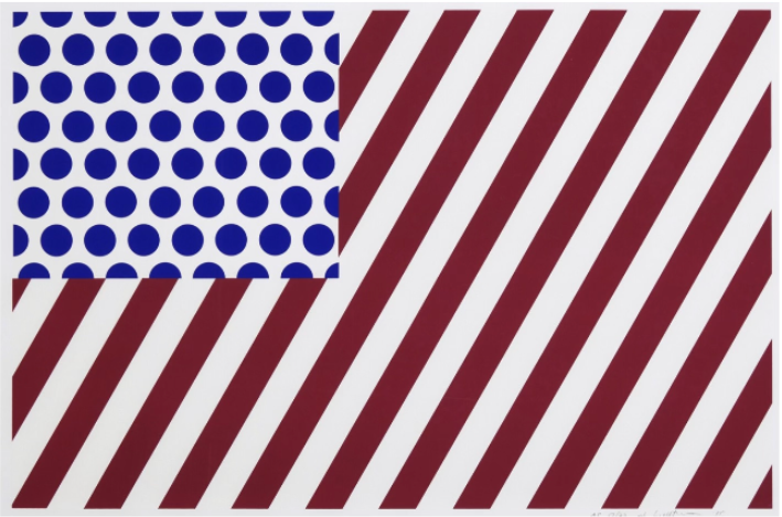
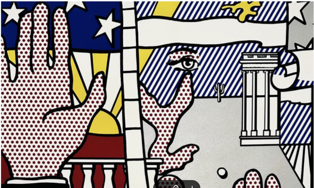
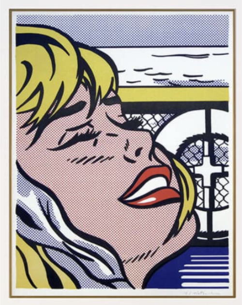
Roy Lichtenstein’s art style is a form of Pop Art built from the look of commercial printing. He used thick black outlines, flat areas of a few strong colors, regular patterns of Ben-Day dots and the speech balloons of comic strips. The result looks machine-made, though he composed and adjusted every part of it by hand.
The 5 Main Characteristics of Lichtenstein’s Art
Five features appear again and again across the early 1960s paintings and the 1990s prints:
- Outlines: Heavy black lines close every shape, the way an inker finishes a comic page.
- Color: Red, yellow and blue do most of the work, laid down flat with no blending.
- Dots: Even rows of dots stand in for shading, skin tones and skies.
- Text: Speech balloons, captions and sound effects such as “WHAAM!” appear inside the picture.
- Framing: Tight crops cut figures off at the edge, so one image reads like a single frame from a longer story.
Why His Style Is Easy to Recognize
Each of those features comes from printing, a process designed to look identical every time. Lichtenstein copied that look on purpose, so his pictures feel familiar even to people who rarely visit a museum. The sameness stops at the surface. He moved lines, changed colors and cut words from his sources until each composition worked. In his own description of the method, “every mark is really in a different place, however slight the difference seems to some.”
What Are Roy Lichtenstein’s Ben-Day Dots?
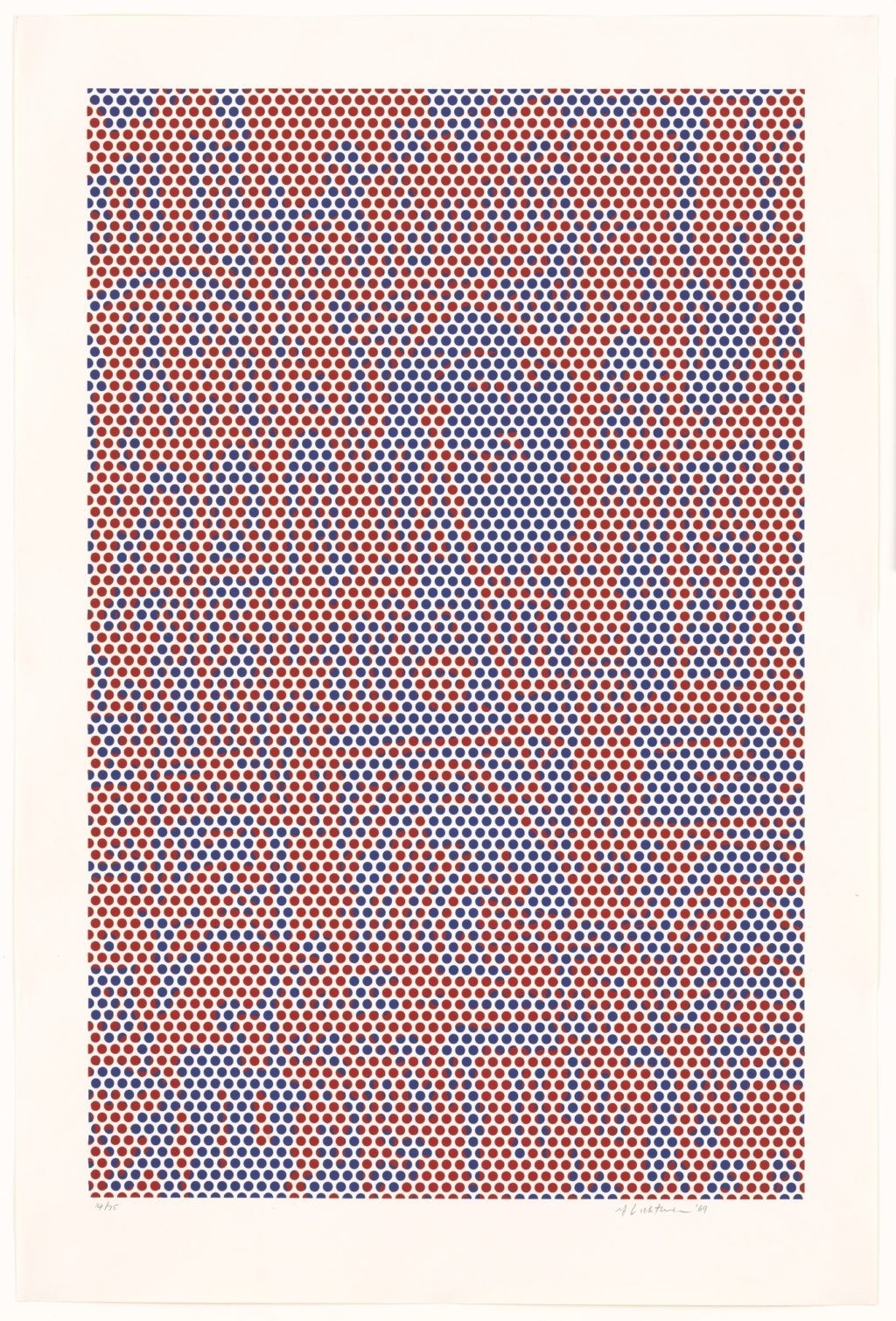
Ben-Day dots are small, evenly spaced colored dots taken from commercial printing, where they gave comics and newspapers cheap areas of shading and color. Lichtenstein enlarged them until anyone could see them from across a room. In his paintings they are the first thing people recognize, and they make you notice how a mass-produced image is put together.
How the Dots Create Color, Tone and Texture
A field of red dots on white paper reads as pink from a few steps back. Comic printers used the effect to suggest skin, sky or shadow without mixing a new ink. Lichtenstein applied the same idea in paint. A face gets red dots and a background gets blue ones. From a normal viewing distance, your eye does the mixing. Closely packed dots give a stronger tone than widely spaced ones.
Why Lichtenstein Made Printing Effects So Visible
In a comic, the dots are tiny and nobody is meant to notice them. Lichtenstein enlarged them until each one stood out on its own. The method moved to the front of the picture, so you see the image and the cheap process used to print it at the same time. In the early 1960s, abstract painters prized the visible gesture of the artist’s hand. Painting a printer’s dot by hand ran directly against that.
Ben-Day Dots Versus Halftone Printing
Ben-Day and halftone are two different things. MoMA describes the Ben-Day process as an inexpensive mechanical printing method developed in the late 19th century, named after the illustrator and printer Benjamin Henry Day Jr. Halftone does another job. The Society of American Archivists defines halftone as a photomechanical process that suggests many shades of one tone with dots of different sizes. Large dots make the dark areas and small dots make the light ones. In Lichtenstein’s work the dots keep one size across each area of color, which puts them on the Ben-Day side.
How Roy Lichtenstein Used Comic-Book Imagery
Lichtenstein took single panels of comic-book imagery from war and romance titles and rebuilt them as paintings. He kept the speech balloons, the sound effects and the dramatic faces, then tightened the drawing and the crop. One frame ends up suggesting a whole plot, leaving you to fill in what happened before and after.
Speech Bubbles, Action Lines and Exaggerated Emotion
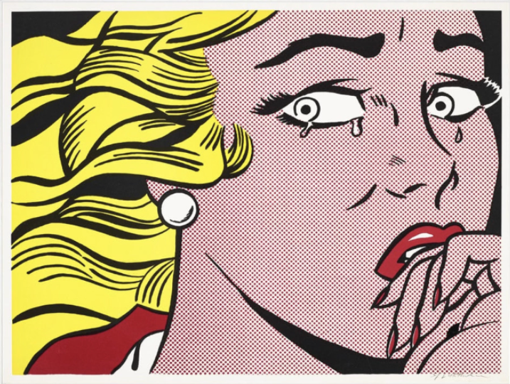
Comic artists had a fixed set of tools for telling a story fast. A balloon carries a character’s thoughts. Speed lines push a plane across the panel, and a single tear is enough to show heartbreak. Lichtenstein used all of them and picked panels where the drama peaks: a pilot firing, a woman crying, a couple about to kiss. Moments like these make sense on their own, so the painting does not need the rest of the story.
How Cropping and Composition Create Drama
Whaam! shows how far he would push a source. Tate traces the composition to a panel in DC Comics’ All-American Men of War #89, published in February 1962 and drawn by Russ Heath and Irv Novick. The original was one panel. Lichtenstein spread it over two canvases, with the attacking plane on the left and the explosion on the right, divided by a clean line. The split makes you read the shot and the blast as two separate moments.
Why Familiar Comic Images Became Fine Art
Size, material and setting changed the way people looked at these pictures. He took panels a few inches wide and painted them several feet across, for a commercial gallery where people judged them as paintings.
Lichtenstein explained the move himself: “I am nominally copying, but I am really restating the copied thing in other terms.”
Critics in the early 1960s argued over whether that counted as art. Today the same paintings belong to Tate, MoMA and the National Gallery of Art.
How Roy Lichtenstein Made His Art
Lichtenstein started from an existing image, usually a comic panel, an ad or a children’s book. He drew his own version, changed the text and the crop, then painted it with controlled outlines, flat color and dots. His prints went through professional workshops. The exact method depends on the date and medium of each work.
From Source Image to Finished Composition
Look Mickey (1961), which the Art Institute of Chicago calls “his breakthrough painting that announced the Pop Art style,” came from a Little Golden Book, Donald Duck Lost and Found. Two years later he built Drowning Girl from a splash page in Secret Hearts #83, a 1962 DC romance comic drawn by Tony Abruzzo. According to MoMA, he cropped the page until the woman is alone with the wave, cut her line from “I don’t care if I have a cramp!” to “I don’t care!” and renamed her boyfriend from Mal to Brad. Each change makes the picture simpler and stronger.
Painting Techniques and Mechanical-Looking Dots
His dot technique evolved over the years. In Look Mickey the dots are painted by hand and used sparingly, on Mickey’s face and in Donald’s eyes. In the early 1960s, he started rubbing paint through a perforated stencil with a toothbrush, which gave him even rows over larger areas. By 1969, for the Haystacks and Cathedrals prints, the dots were generated photographically. Before you assume how a specific work was made, check when he made it and in what medium.
Screenprinting and Other Printmaking Techniques
A screenprint is made by pushing ink through a fine mesh, with a stencil blocking the areas meant to stay blank. Each color needs its own screen. The curator Stephen Coppel, quoted by Sotheby’s, calls it the ideal medium for the impersonal commercial effect Lichtenstein wanted.
He also made lithographs and woodcuts, and he worked for decades with the printer Kenneth Tyler, first at Gemini G.E.L. in Los Angeles and later at Tyler Graphics in New York. The Sower (1985) combines lithograph, woodcut and screenprint on one sheet. Prints like this were planned as editions from the start. They are original works, not copies of paintings.
How Pop Art Changed the Relationship Between Popular Culture and Fine Art
Pop Art brought comics, advertising and consumer goods into galleries and museums, and Lichtenstein was one of its leading figures. By copying the look of mass printing, he raised two questions contemporary art still argues about: what makes an image important, and where an original work ends and a reproduction begins.
What Makes Lichtenstein a Pop Artist?
Pop artists took their subjects from mass media and from the products people bought every day. Roy Lichtenstein borrowed the printing language as well. His 1962 Castelli show brought the borrowed look into a commercial gallery at full painting scale. Nobody needed an art education to recognize where the images came from.
Originality, Appropriation and Artistic Authorship
Redrawing another artist’s panel and signing the result raised real questions about authorship. The current Whitney show deals with them directly. Curated by Meg Onli with guest curator Alex Da Corte, it hangs Lichtenstein next to Sturtevant, who copied other artists’ work, his own included; Richard Pettibone, who made small reproductions of modernist paintings; and Louise Lawler, who photographs artworks in the homes and rooms where they hang. Each of them pushes the question of copying in a new direction.
How Lichtenstein’s Style Compares With Andy Warhol
Warhol and Lichtenstein both drew on popular culture and both imitated mechanical reproduction, but they worked in different ways. Warhol transferred photographs onto canvas with silkscreens and repeated them, with celebrities and branded products as his usual subjects. Lichtenstein redrew comics and ads by hand, refining line and color as he went. A Warhol often looks like a photograph printed many times over. A Lichtenstein looks like one comic panel redrawn with great care.
Avery Andon, chief executive of ArtLife Gallery, sees nearly every new buyer start with the comic years: “People come in wanting the Lichtenstein everybody knows, the crying girls, the explosions, the fighter planes. Very few of those early images ever come up for sale, so buyers end up discovering the later work, the Brushstrokes, the Reflections, the Interiors. Then they realize it’s the same language. The dots and the black line are still there, applied to different subjects. Collectors who see that connection tend to buy with a lot more confidence.”
Famous Roy Lichtenstein Artworks That Reveal His Style
A handful of works trace how his style developed. Look Mickey opened the comic period, and Whaam! and Drowning Girl are its best-known paintings. Brushstroke answered the abstract painters who came before him. Later series applied the same dots and outlines to Monet’s haystacks, reflections on glass, water lilies and the female nude.
Look Mickey (1961)
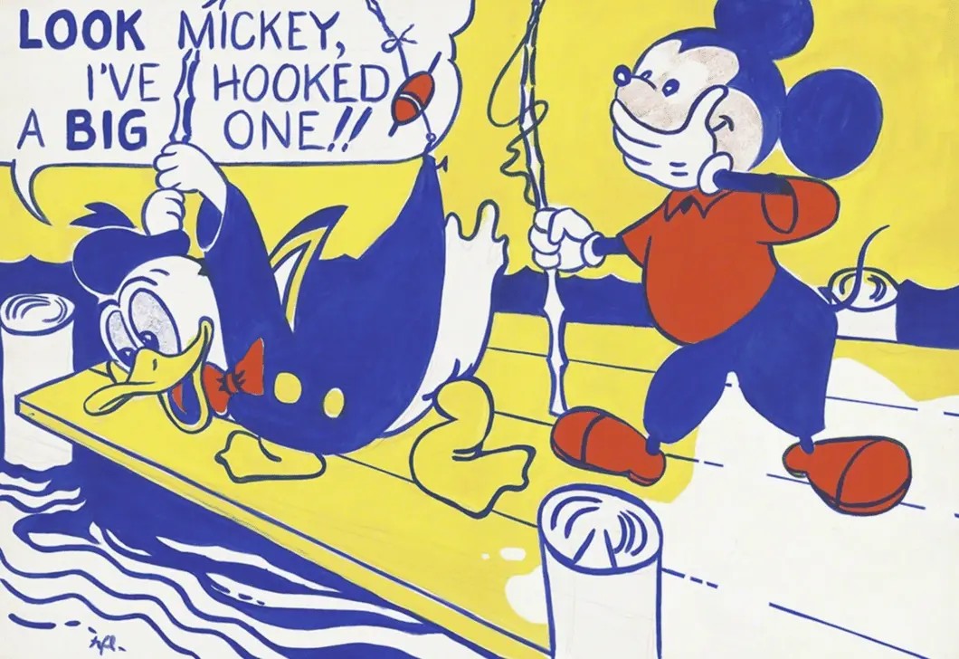
Donald Duck stands on a dock, convinced he has hooked a big fish, while his line is caught on his own jacket and Mickey tries not to laugh. The colors are flat, the outlines heavy and the dots still few. The National Gallery of Art in Washington owns the painting, a gift from the artist.
Whaam! and Drowning Girl (1963)
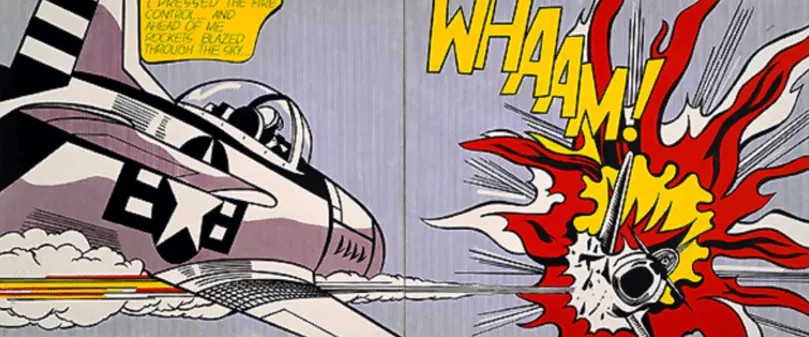
These two paintings cover the two kinds of comics he drew on most, war and romance. Whaam! is loud, wide and split in two. Drowning Girl is tight, nearly square and built around one face and one wave. Both let the speech balloon drive the story.
Brushstroke (1965)
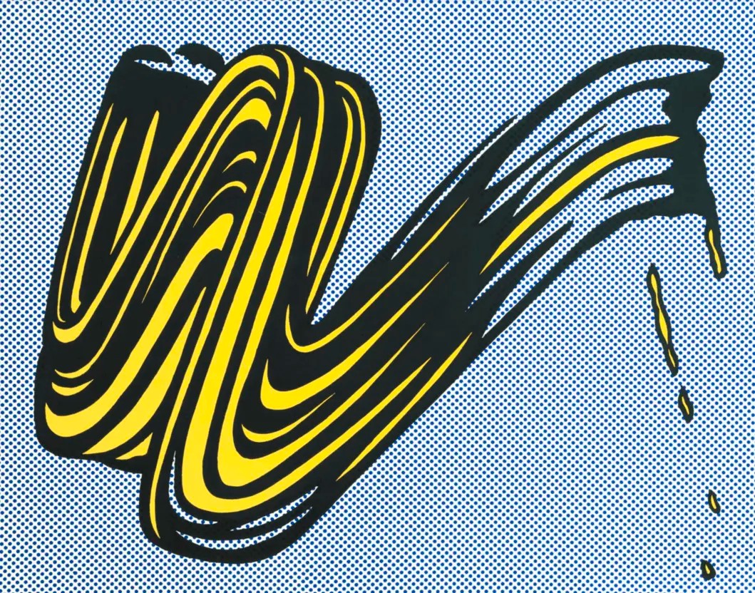
The free, dripping brushstroke was the signature mark of Abstract Expressionism, the leading style in New York painting during the 1950s. Lichtenstein drew it with comic outlines and flat color, as if it had been printed. The screenprint came out in an edition of 280.
Haystacks and Cathedrals (1969)
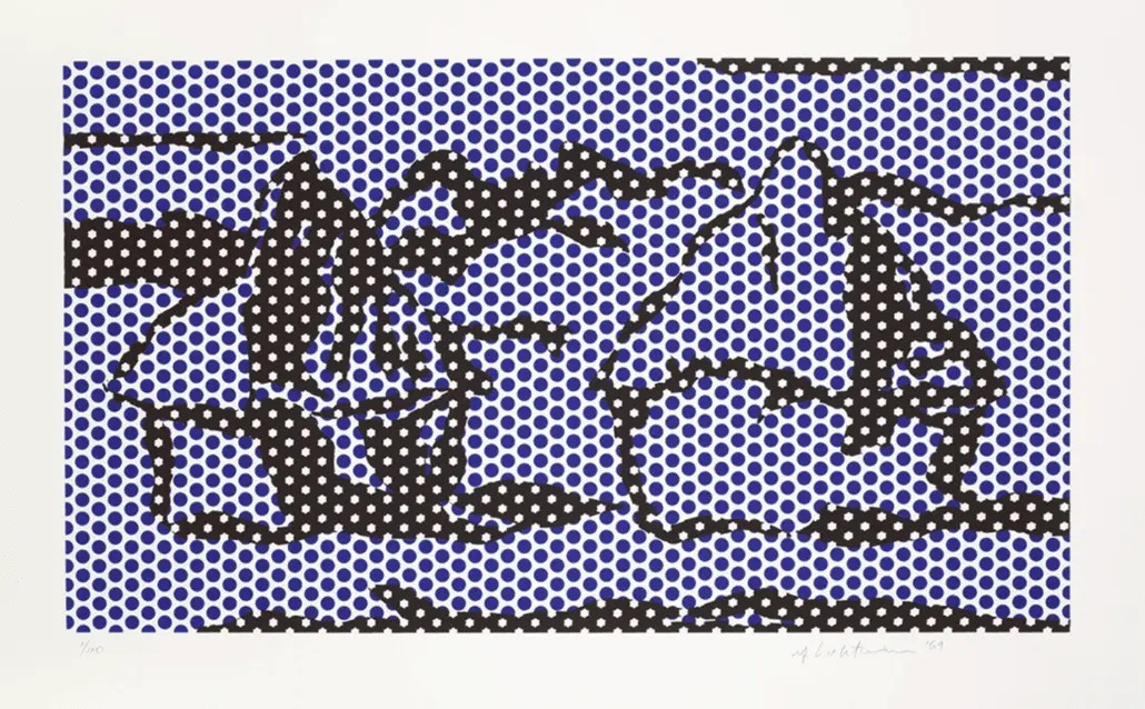
Monet painted haystacks and Rouen Cathedral over and over, in different light. Lichtenstein reworked both subjects as prints built from dots and color, his first project with Gemini G.E.L.
Reflections (1990)
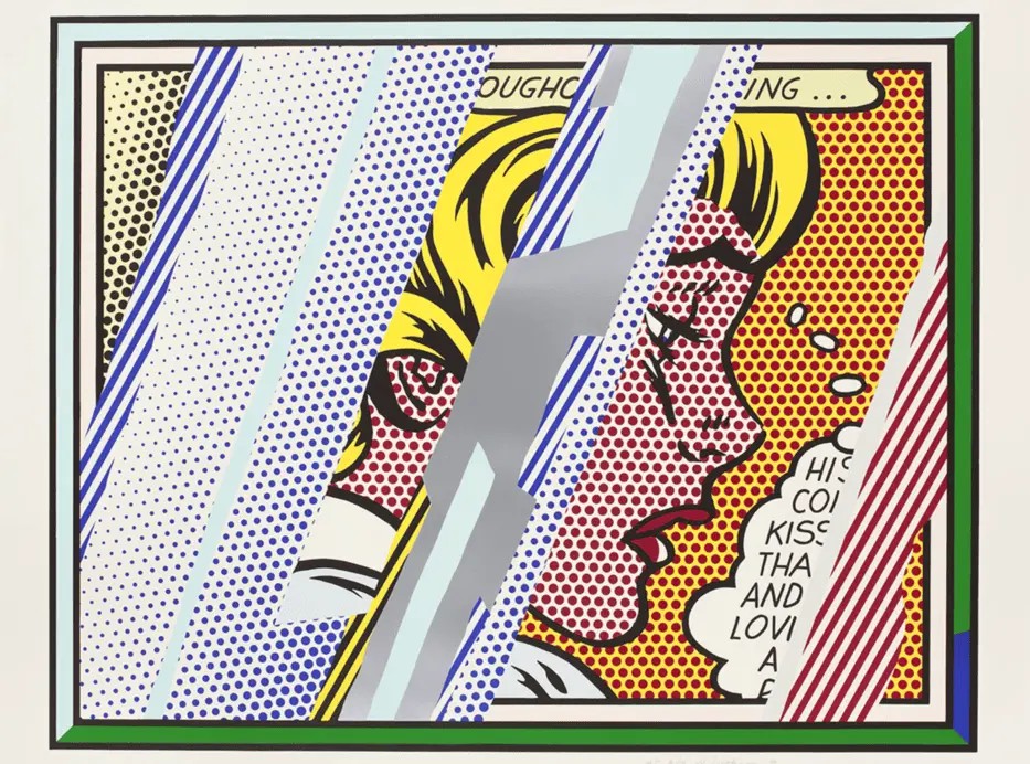
Tyler Graphics published the Reflections prints. In them, bands of color and dots cross his own earlier images, as if you were seeing them behind glass.
Water Lilies (1992)
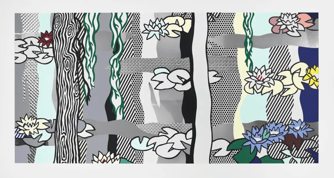
Lichtenstein made the Water Lilies with Saff Tech Arts. He screenprinted the enamel on stainless steel, so the metal shows through the color and reflects the room around it.
Nudes (1994)
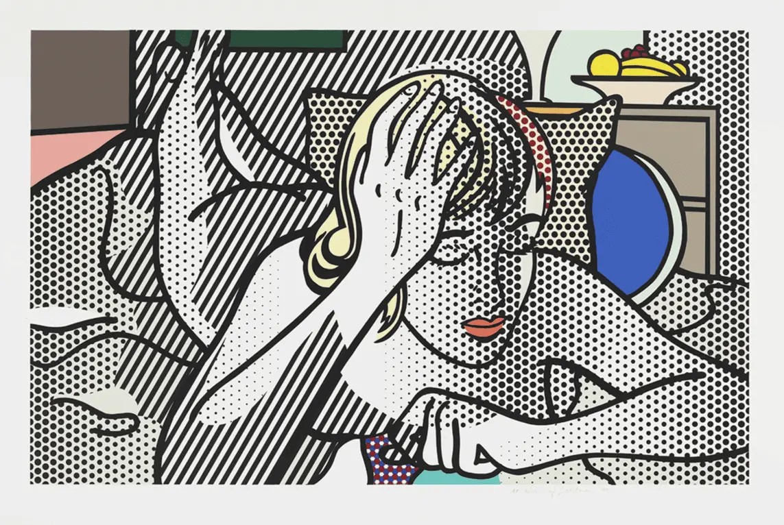
His last prints with Tyler bring the comic-style woman back, now shown without clothes and shaded with dots. Sotheby’s describes the series as the first time he portrayed the female nude.
Our Roy Lichtenstein investment guide compares how these series have held up in the market.
What Lichtenstein’s Artistic Techniques Mean for Collectors
Knowing his Pop Art techniques helps you tell what kind of object you are looking at and where it belongs in his career. Style alone cannot prove a work is genuine, because posters and copies borrow the same look. Medium, edition, signature and documentation decide what you actually own.
How to Recognize Different Lichtenstein Works
His output falls into four broad groups, each with its own market:
- Paintings: Unique works on canvas, mostly held by museums and major private collections.
- Prints: Editions made with workshops such as Gemini G.E.L. and Tyler Graphics, usually signed and numbered in pencil.
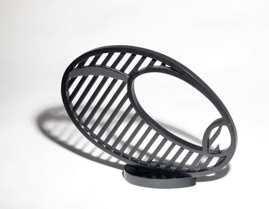
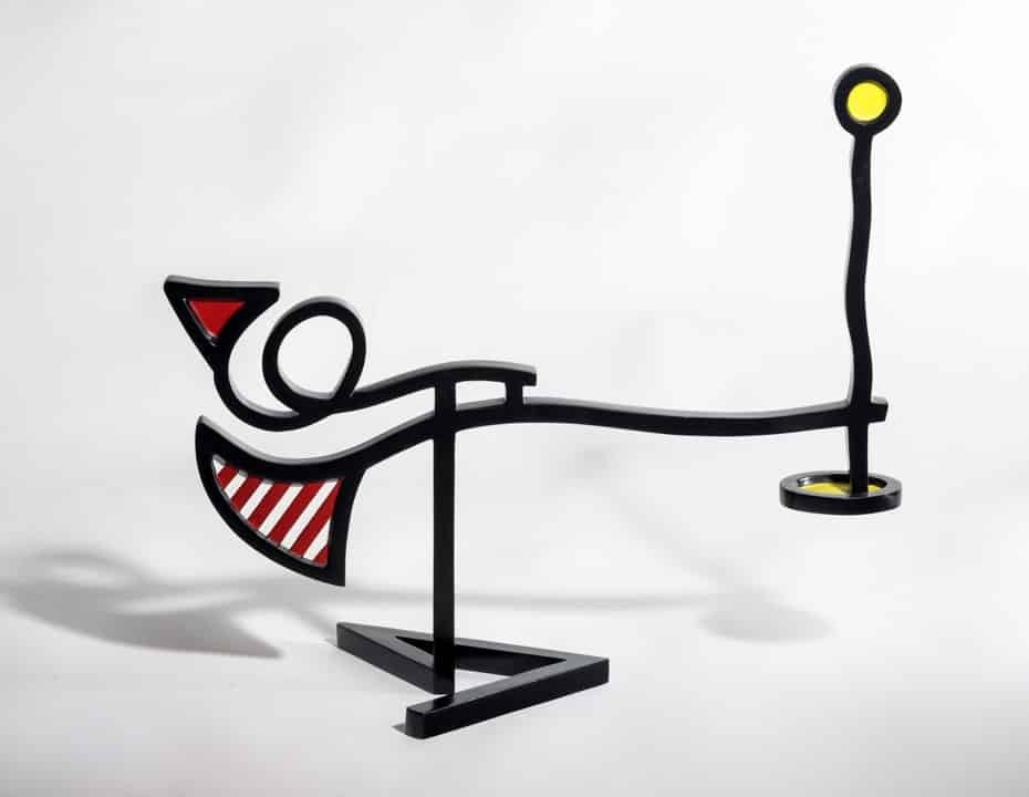
- Multiples and objects: Enamel-on-steel pieces, ceramics and sculptures produced in small editions.
- Posters and announcements: Exhibition posters and gallery mailers printed in larger quantities.
Sotheby’s advises first-time buyers to avoid the Leo Castelli Gallery mailers of the 1960s unless they come from a reputable source. They were printed in quantity to announce his shows.
Why Medium, Edition and Provenance Matter
The same image can appear on very different objects. One may be a numbered impression from the original edition, another a proof, another a poster printed for an exhibition. The medium, the edition details, the signature and the ownership history decide which one you have. Checking those details one by one is how you authenticate a Roy Lichtenstein print. The same details set what a Lichtenstein print is worth at auction and in galleries.
How to Look More Closely at a Lichtenstein Artwork
Spend a few minutes with the work itself before you open any paperwork. These are the points worth studying:
- Dots: Check whether they are even in size and spacing, and whether they look painted, stenciled or printed.
- Outlines: Follow the black line around each shape and look at how clean and steady its edges are.
- Color: Count the colors. Most works rely on a small set of flat hues with no blending.
- Composition: Notice where the crop cuts the figure and where your eye lands first.
- Source: Identify the image behind the work, whether a comic, an ad or another artist’s painting.
- Series: Place the work in its series and decade, because his technique changed over time.
For Nico Hayes, senior director at ArtLife, a trained eye comes from comparing works side by side: “The technique tells you the decade before you read a single label. Hand-painted dots, stenciled dots, photographic dots, the wood grain in the late Interiors. Once you’ve looked at enough of them, you see the period right away. That knowledge protects collectors. People who skip it end up paying for an image they like without knowing where it falls in his career, and the market is very good at telling those works apart.”
ArtLife handles Roy Lichtenstein prints and works on paper. Browse our Roy Lichtenstein collection to see what is available today, or ask our team about a specific work.
Frequently Asked Questions
What is Roy Lichtenstein’s art style called?
Most writers place his work in Pop Art, the movement that drew its subjects from comics, advertising and consumer culture in the late 1950s and 1960s. His version is easy to spot, with bold black outlines, flat primary colors, Ben-Day dots and speech balloons taken from comic strips, all painted with great precision.
Why did Roy Lichtenstein use Ben-Day dots?
Dots let his paintings look like cheap printed images, because the dot was the clearest mark of commercial printing in comics and newspapers. He painted them large enough to see, so the printing process is part of what you are looking at. Viewers saw a picture and, at the same time, the industrial method normally hidden inside it.
How did Roy Lichtenstein make his paintings look like comics?
Real comic panels were his starting points. He redrew them with heavier outlines, flat color and regular dots. Speech balloons and sound effects stayed in, the text got shorter and the crop got tighter, so one moment carried the whole story. The finished painting looks printed, yet he placed every line by hand.
Did Roy Lichtenstein paint the dots by hand?
In Look Mickey (1961), his breakthrough comic painting, the dots are hand-painted and few. In the early 1960s he moved to rubbing paint through perforated stencils with a toothbrush, which produced even rows. For the prints he made from 1969 onward, such as Haystacks and Cathedrals, the dot patterns were made on light-sensitive plates.
What printing techniques did Roy Lichtenstein use?
Screenprint and lithography were his main techniques. He later added woodcut and often combined several methods on one sheet. Gemini G.E.L., Tyler Graphics and Saff Tech Arts were among the workshops behind his editions. Some late projects went beyond paper, including the Water Lilies, screenprinted in enamel on stainless steel.
What is the difference between Lichtenstein and Andy Warhol?
Both artists used popular imagery and the look of mass production. Warhol worked from photographs, screened them onto canvas and repeated them, picking film stars and supermarket brands as subjects. Lichtenstein redrew comic panels and ads by hand and built each image from black line, primary colors and dot patterns.
Why is Roy Lichtenstein important to Pop Art?
Lichtenstein proved that the visual language of comics and cheap printing could carry a serious painting. His 1962 show at Leo Castelli Gallery put the idea in front of the New York art world. Today Whaam! and Drowning Girl belong to Tate and MoMA. His questions about copying and originality still shape younger artists.
Are Roy Lichtenstein’s works paintings or prints?
His output includes both, along with drawings, sculptures, ceramics and enamel works. The paintings are unique and mostly belong to museums and major collections. The prints, signed editions made with professional workshops, are the part of his work most collectors can actually buy. Posters and announcements form a separate, cheaper category.
Looking to Buy a Roy Lichtenstein Art?
Explore original Roy Lichtenstein screenprints and works on paper with ArtLife Gallery. From his iconic Look Mickey and Brushstroke to Reflections and Crying Girl, discover available works that bring the artist’s unmistakable pop art style into your collection.